How to Customize the Loyup Widget Launcher
The widget launcher is a floating button on your storefront that gives customers quick access to their rewards and loyalty activities from any page. You can adjust where it sits, how it looks, and what it says so it fits your brand.
Open the widget launcher editor
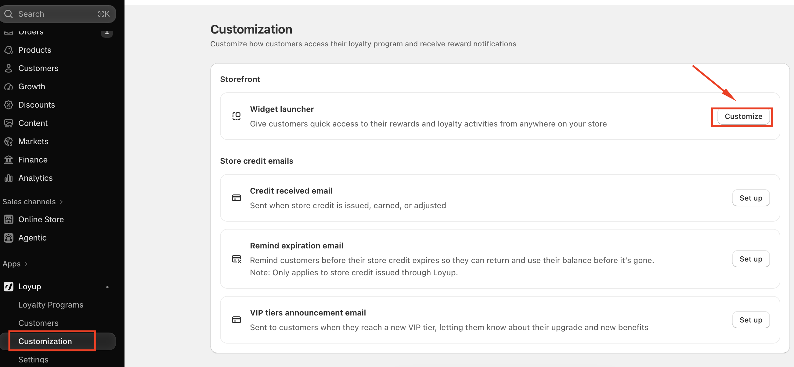
- In your Shopify admin, go to Apps > Loyup > Customization.
- Under Storefront, find Widget launcher and click Customize.
- At the top of the editor, make sure the Widget launcher toggle is on. The Activated label confirms it's live on your store.
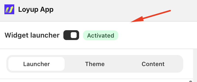
The editor has three tabs: Launcher, Theme, and Content. A live preview on the right shows your changes as you make them.
Launcher tab: placement and button style
Use this tab to control where the launcher appears and what the floating button looks like.
Placement
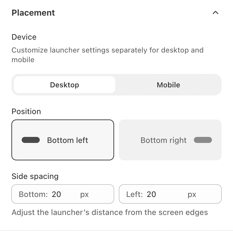
- Device: Set up Desktop and Mobile separately, so the launcher fits each screen size.
- Position: Choose Bottom left or Bottom right.
- Side spacing: Set the distance, in pixels, from the bottom and side edges of the screen. Increase it if the launcher overlaps a chat bubble or cookie banner.
Floating button
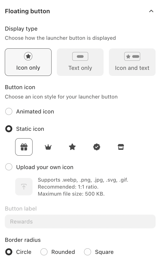
- Display type: Show the button as Icon only, Text only, or Icon and text.
- Button icon: Pick an Animated icon, choose a Static icon (gift, crown, star, badge, or store), or Upload your own icon. Uploads support .webp, .png, .jpg, .svg, and .gif files up to 500 KB, and a 1:1 ratio works best.
- Button label: Enter the text shown on the button, such as "Rewards", when you use a text display type.
- Border radius: Make the button a Circle, Rounded, or Square.
Theme tab: style and colors
Use this tab to match the widget to your brand.
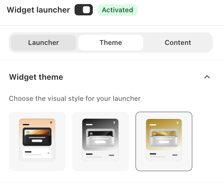
Widget theme
Choose one of the ready-made visual styles. The preview updates right away, so you can compare them before deciding.
Color settings
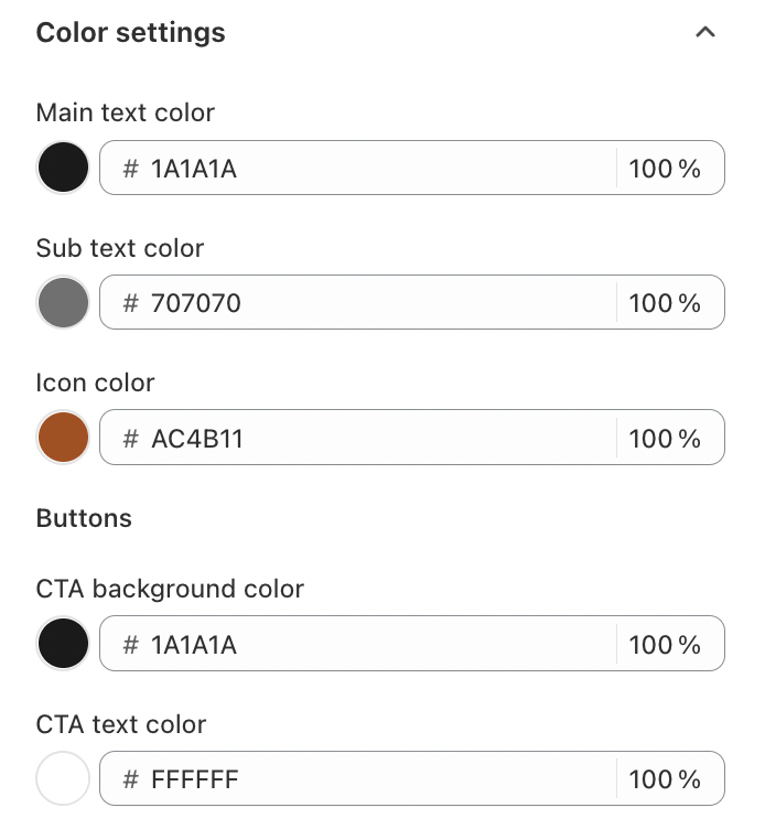
Fine-tune each color with a hex code and an opacity percentage:
- Main text color: headings and primary text.
- Sub text color: descriptions and secondary text.
- Icon color: the icons in lists such as Ways to earn.
- CTA background color and CTA text color: the main buttons, such as Sign in.
Tip: keep enough contrast between the CTA background and text colors so buttons stay easy to read.
Content tab: widget text
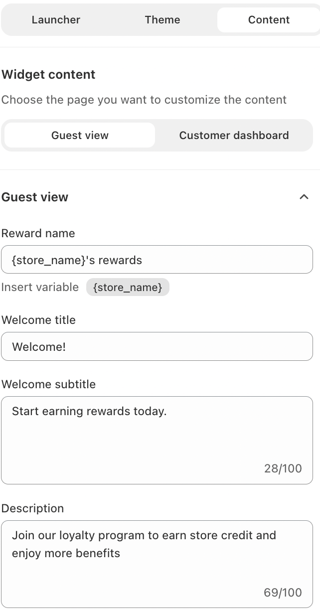
Use this tab to write the text customers see in the widget. Pick which page to edit:
- Guest view: what visitors see before they sign in.
- Customer dashboard: what signed-in customers see.
Guest view fields
- Reward name: the name of your program, for example
{store_name}'s rewards. Click the{store_name}variable to insert your store's name automatically. - Welcome title: the main greeting, such as "Welcome!"
- Welcome subtitle: a short line under the title, up to 100 characters.
- Description: a brief invitation to join, up to 100 characters.
- Button label: the text on the sign-in button, such as "Sign in".
Keep the wording short and inviting. Visitors decide in seconds whether to join, so lead with the benefit, such as earning store credit.
Save your changes
When the preview looks right, save your changes. The updated launcher appears on your storefront for both guests and signed-in customers.
If you have any concerns or questions, please do not hesitate to contact us at [email protected]